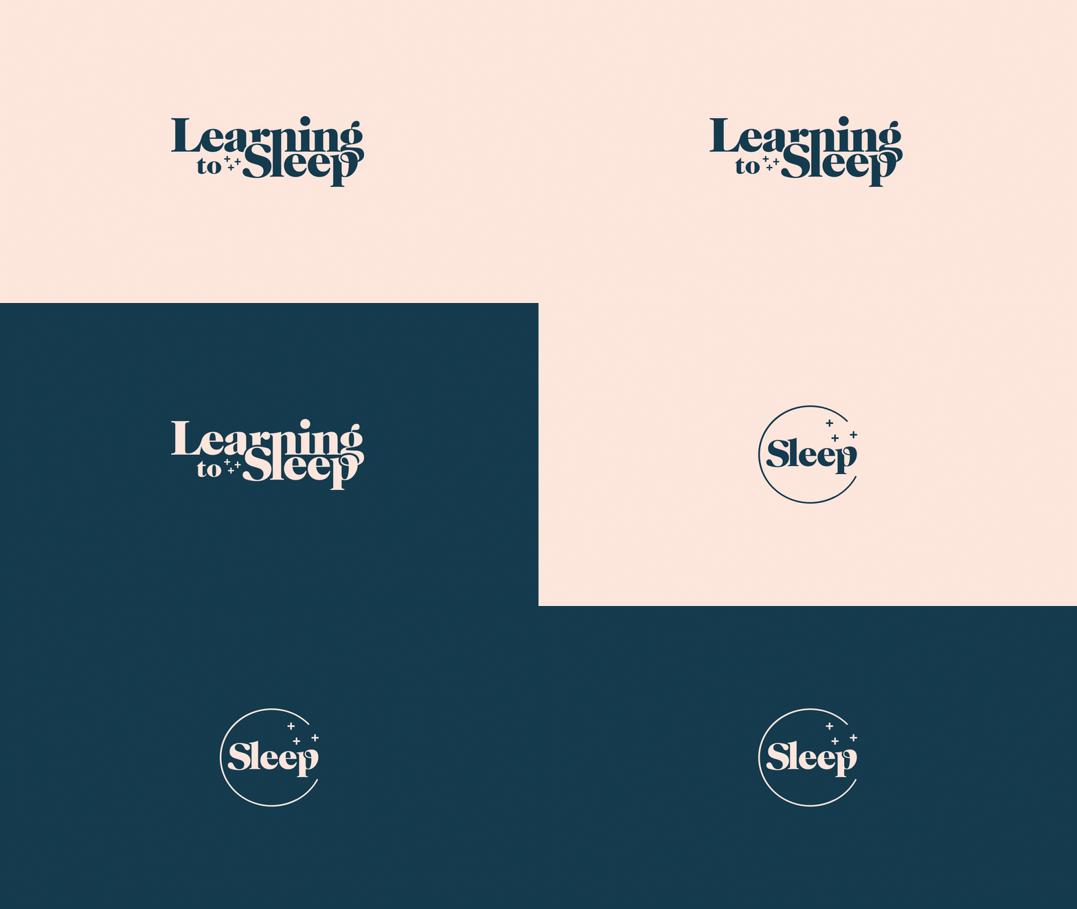
Learning to sleep
Learning to Sleep is a Swedish digital sleep clinic that offers CBT treatment within an easy-to-use mobile app. For five weeks, the patient receives support, information, and a weekly session with a psychologist via video calls. The method has proven to be very successful: 94 percent of treated patients have received proven sleep improvement!
Check out Learning to Sleeps website for more information.
Thanks to Learning to Sleep, anyone experiencing sleep disruption can get easy access to professional and effective treatment – and this important work needs to be reflected in their branding.
So, together with our friends at Learning to Sleep, we developed a brand strategy and a new visual identity, including a new logo.
For Learning to Sleep, it was important that the brand conveyed warmth and humanity, as well as professionalism.
The main brand colors are light beige and dark blue. The two colors compliment and reinforce one another; the beige has a warm tone to it, and the blue stands for calmness and stability. The blue is also a representation of the night sky. As secondary colors, the orange-red adds strength and the light blue adds freshness to the brand.
The brand's graphical elements are soft and have an organic roundness to them. For example, splashes and bumpers are formed as organs (brain, heart, kidney, and liver) to symbolize the fact that one's sleep affects the entire body.
We also produced a PowerPoint template that is consistent with brand guidelines.


